Software I’ve built, websites I’ve designed, and the decisions behind them.
Audit automation & risk profiling
Audi Nuvobook
I built Nuvobook around the warranty audits I perform. It brings claims, supporting records, review logic, and reporting into one application, automating repetitive steps and helping auditors focus on higher-risk claims. Findings stay connected to their evidence, so another reviewer can follow the reasoning. Results from Audi Team Dashboard feed back into the risk-profiling logic, helping shape the next round of audits.
Audit workflow automation
Risk scoring & claim prioritization
Traceable findings & reporting
Dashboard-driven feedback loop
My roleApplication design, automation & risk-profiling logic
I built Audi Team Dashboard to bring all audit results into one place and give management a view of what’s happening across the business. The data pipeline connects individual findings with dealer and auditor analysis, so executives can see patterns and decide where to focus. Those findings also feed back into Nuvobook’s risk-profiling logic, linking what we learn from completed audits to the ones that come next.
Integrated audit-results pipeline
Executive & management insight
Dealer & auditor analysis
Nuvobook risk-profiling feedback
My roleData pipeline, application design & development
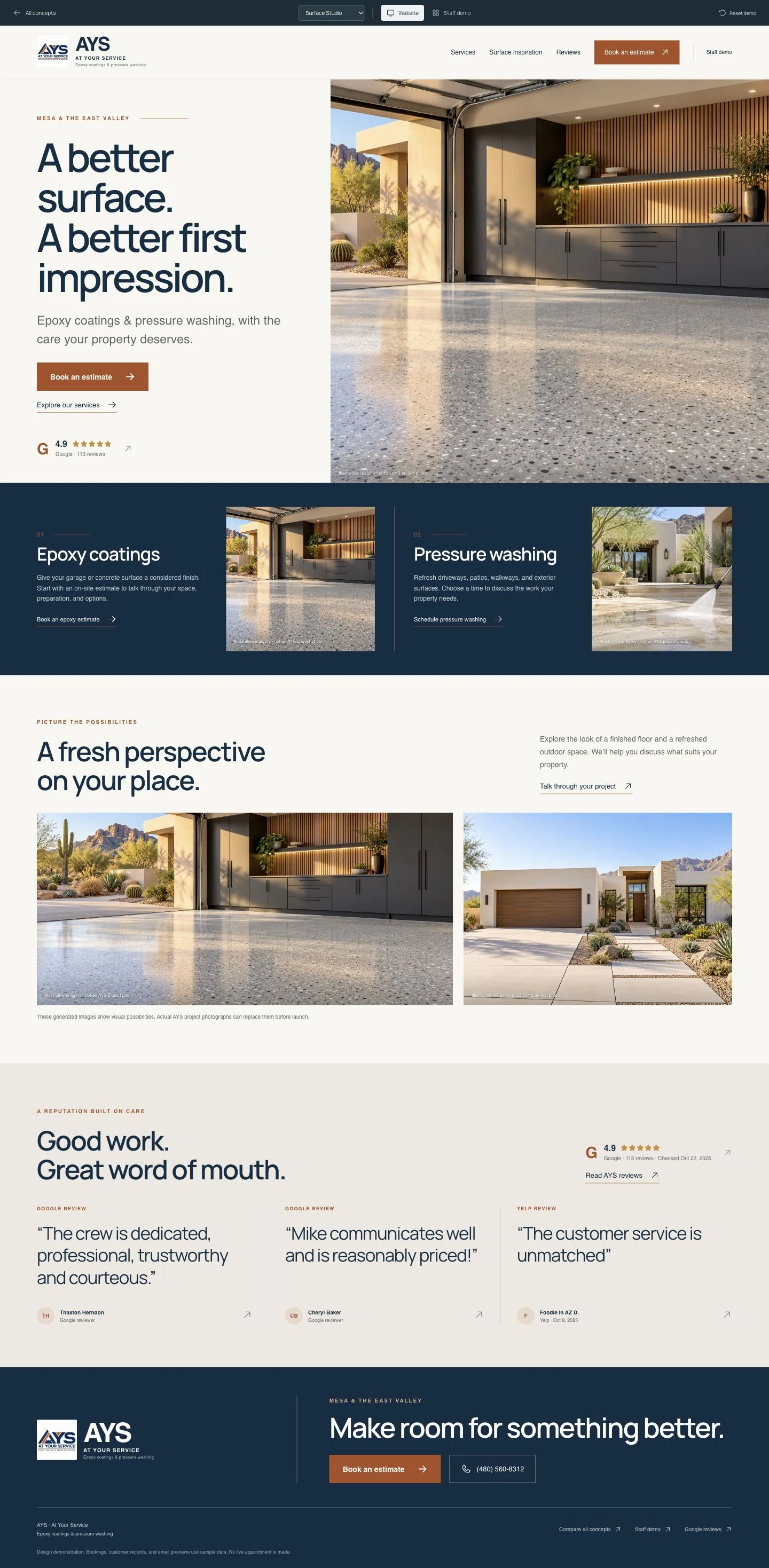
I designed the site around two jobs: helping customers request an estimate and giving staff a workspace to manage inquiries for epoxy coatings and pressure washing.
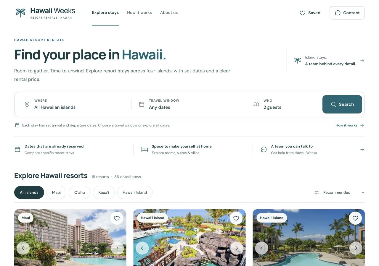
I migrated the resort catalog and organized the site around how people choose a stay: the island, the property, the amenities, and the price. Search and island filters keep those choices within reach.
Coffee & hospitality
Chapman, from coffee to beer.
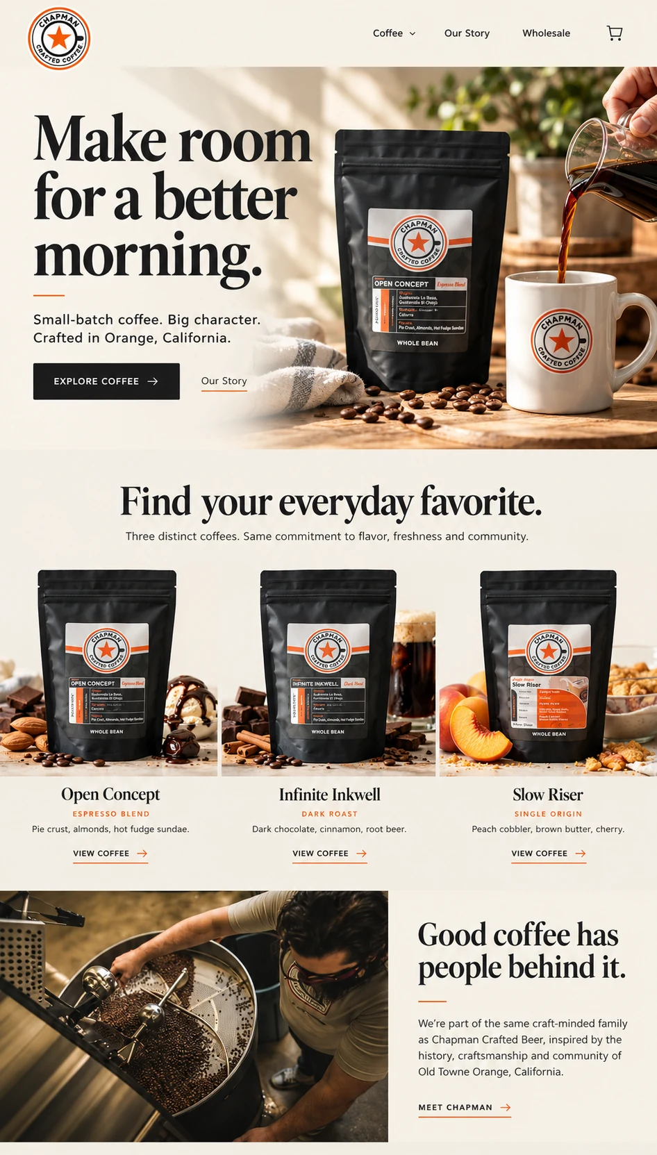
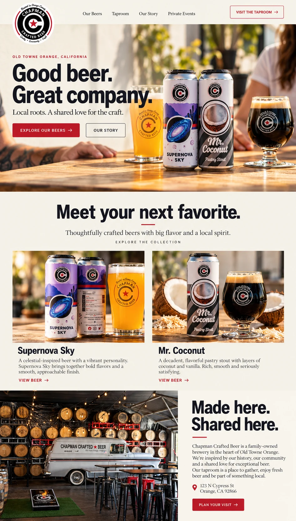
Two homepage designs for Chapman’s coffee and beer brands.
I designed the coffee homepage around the product collection and the feeling of a daily coffee ritual. Warm photography and larger type give the three featured products space without crowding the page.
For the beer homepage, I balanced the cans and glasses with taproom photography. The design gives the products a strong introduction while showing the place and community behind the brand.
The research brand collection
Ten brands. Built on one catalog.
I developed a shared catalog with search, filters, compound details, and research references, then gave each brand its own look.
Brand identity, visual design & catalog development
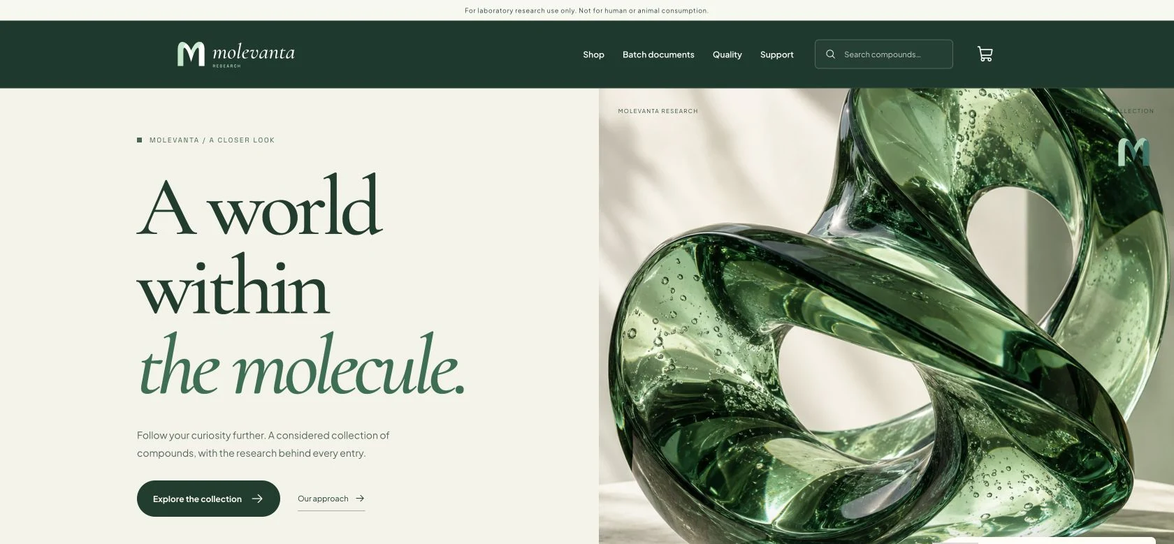
For Molevanta, I started with the emerald glass sculpture and carried its color into the catalog. An ivory background and large editorial type keep the product information easy to read.
Brand identity, visual design & catalog development
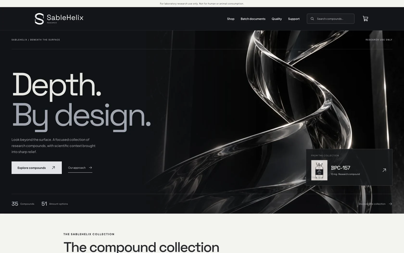
SableHelix takes the catalog in a darker direction. I used a reflective chrome helix as the focal point, with oversized lettering that holds its own against the image.
See the rest of the collection.Eight more research brands
Brand identity, visual design & catalog development
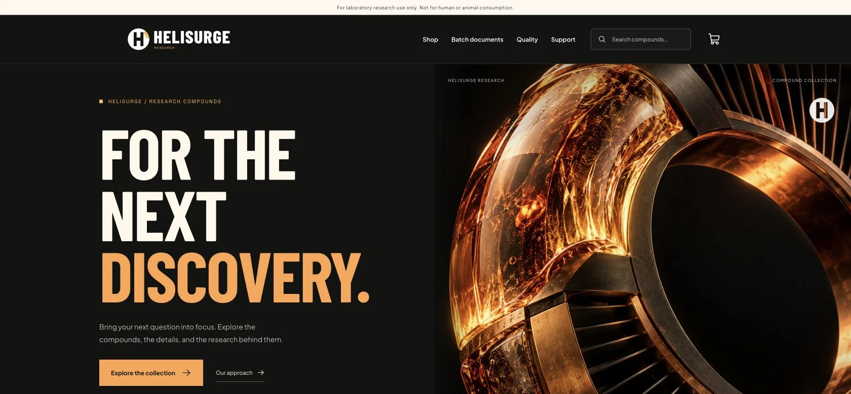
I wanted HeliSurge to feel more energetic, so I paired tightly set, condensed lettering with an illuminated copper sculpture. That visual direction carries through the research catalog.
Brand identity, visual design & catalog development
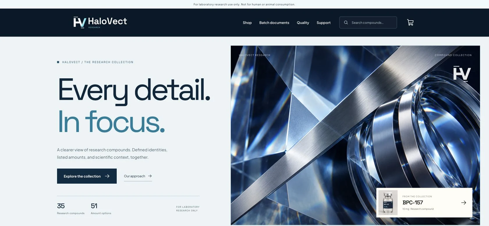
HaloVect uses a split layout to give the headline and optical glass image their own space. I kept the typography simple so the catalog information stays easy to scan.
Brand identity, visual design & catalog development
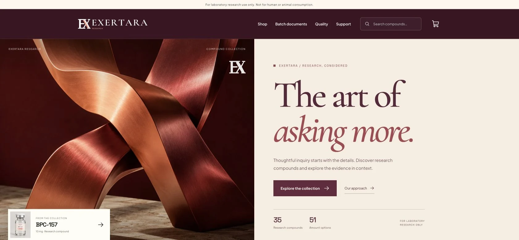
With Exertara, I paired burgundy serif lettering with a copper sculpture on cream. The layout gives the research catalog a warmer, more editorial presentation while keeping the information organized.
Brand identity, visual design & catalog development
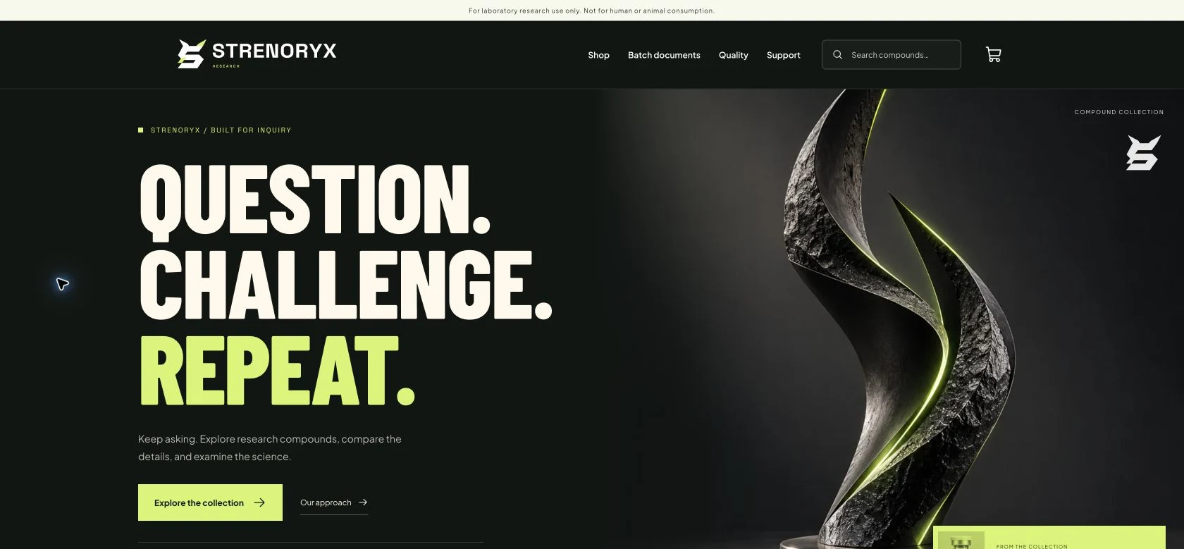
Strenoryx has a sharper look. I used an angular sculpture, condensed lettering, and lime accents, then carried those choices from the homepage into the catalog and product pages.
Brand identity, visual design & catalog development
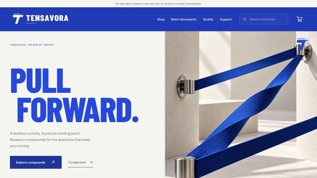
Tensavora uses architectural bands and large blue lettering to establish its identity. I kept the surrounding layout open, giving the imagery a strong presence without burying the research catalog.
Brand identity, visual design & catalog development
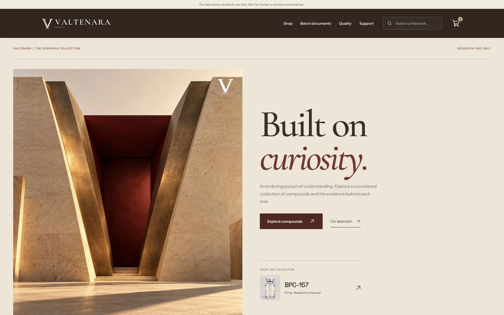
I built Valtenara's visual identity around monumental architecture and large serif lettering. The warm stone imagery gives the research catalog a recognizable setting from the first screen.
Brand identity, visual design & catalog development
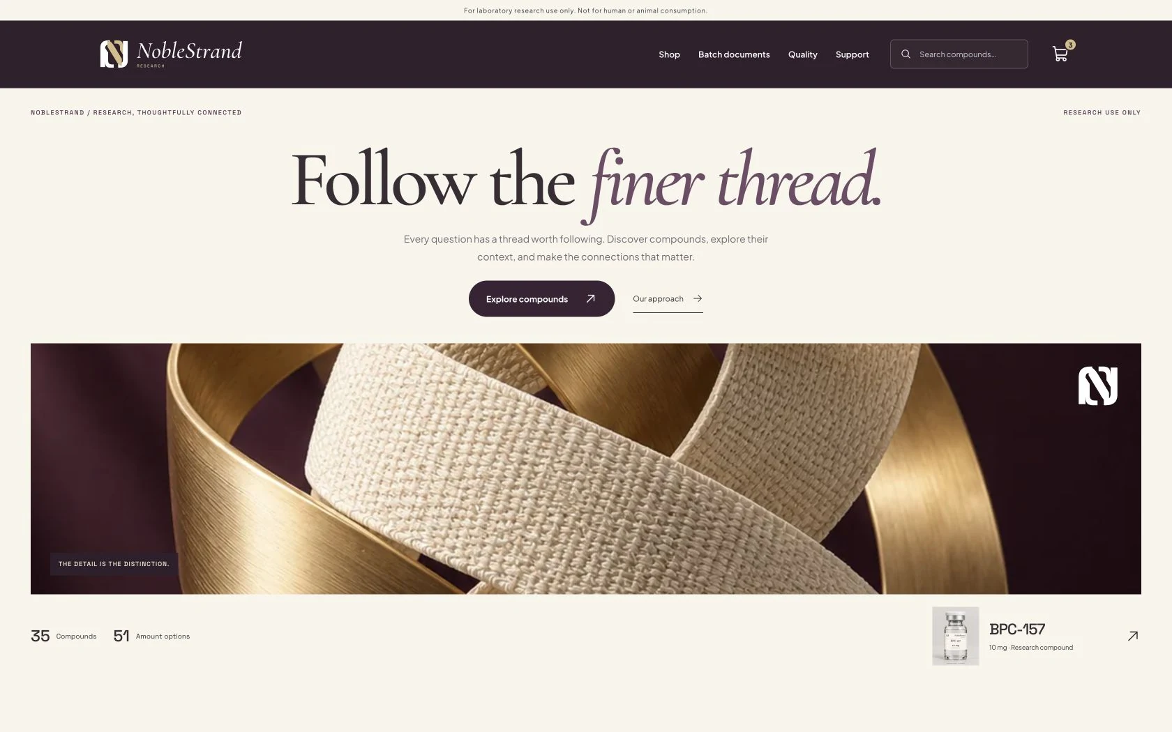
For NobleStrand, the wide image does much of the work. I paired woven material and brushed gold with plum lettering, leaving enough space for the catalog content to stand on its own.
Brand identity, visual design & catalog development
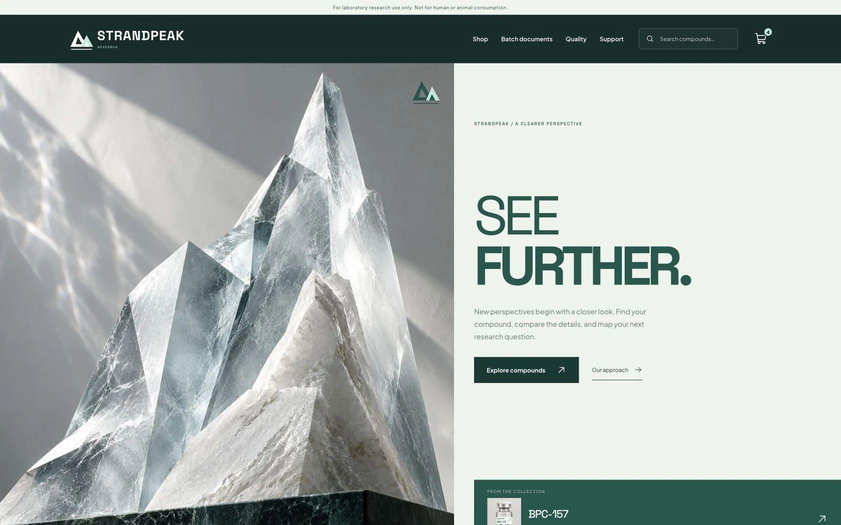
StrandPeak starts with pale sculptural mountain forms and a simple geometric wordmark. I used deep green type and open spacing to carry that restrained look into the research catalog.
Independent website projects
Three separate builds.
Each site has its own purpose. Here’s how I approached them.
Visual design, catalog development & account workflows
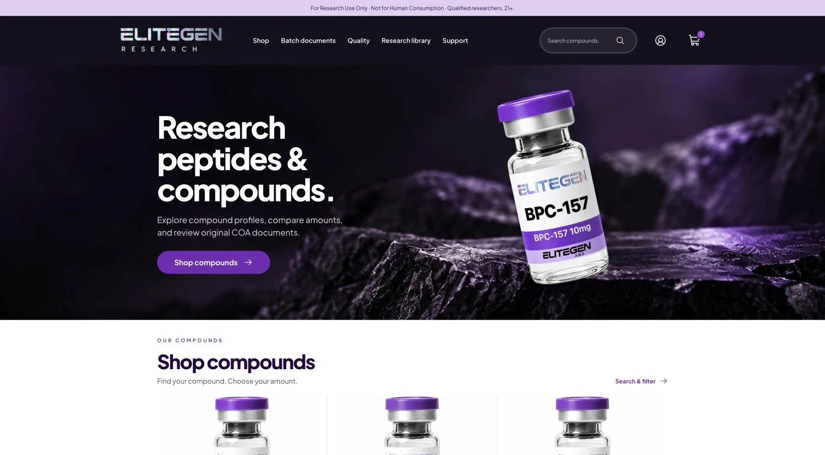
I brought compound search, research profiles, original documents, and customer account tools into one site. The purple product imagery ties the brand together while the catalog gives visitors several ways to find information.
Brand identity, visual design & catalog development
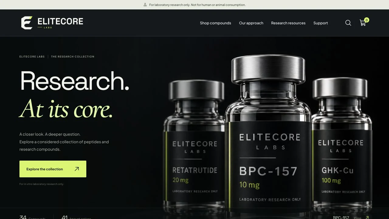
EliteCore puts the branded vial at the center of the homepage. I carried its black and lime identity through the catalog and individual product pages, keeping navigation consistent along the way.
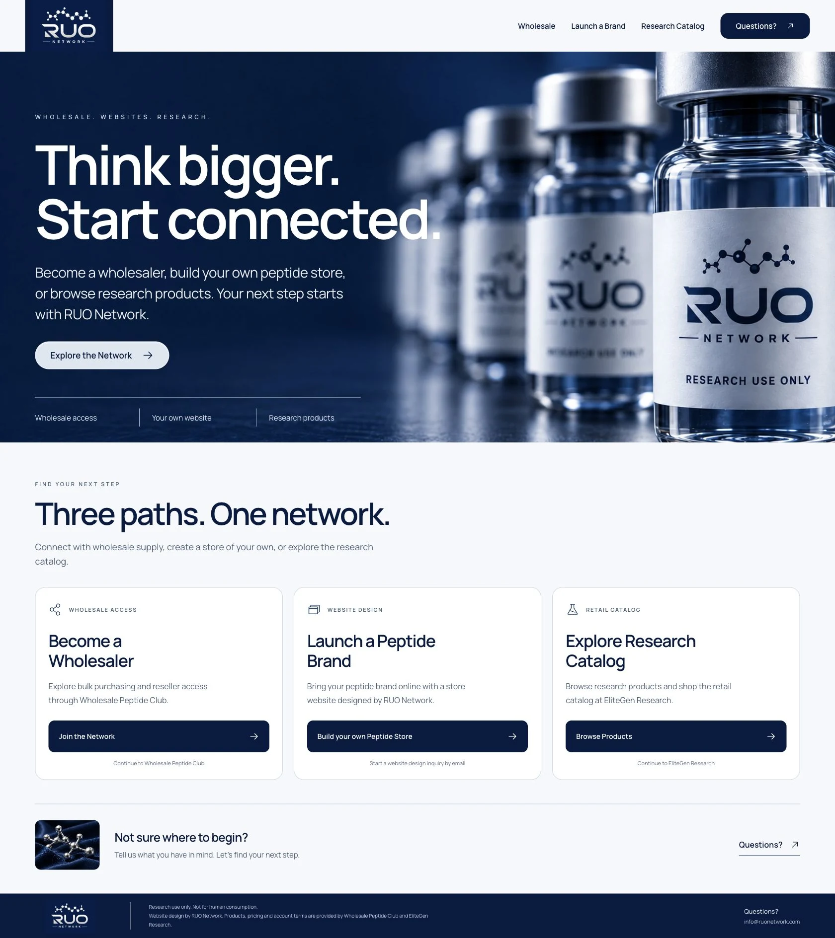
I organized RUO Network around three clear paths: wholesale access, creating a brand, and browsing research catalogs. Each starts from the homepage, with planning resources to help visitors work through their next steps.